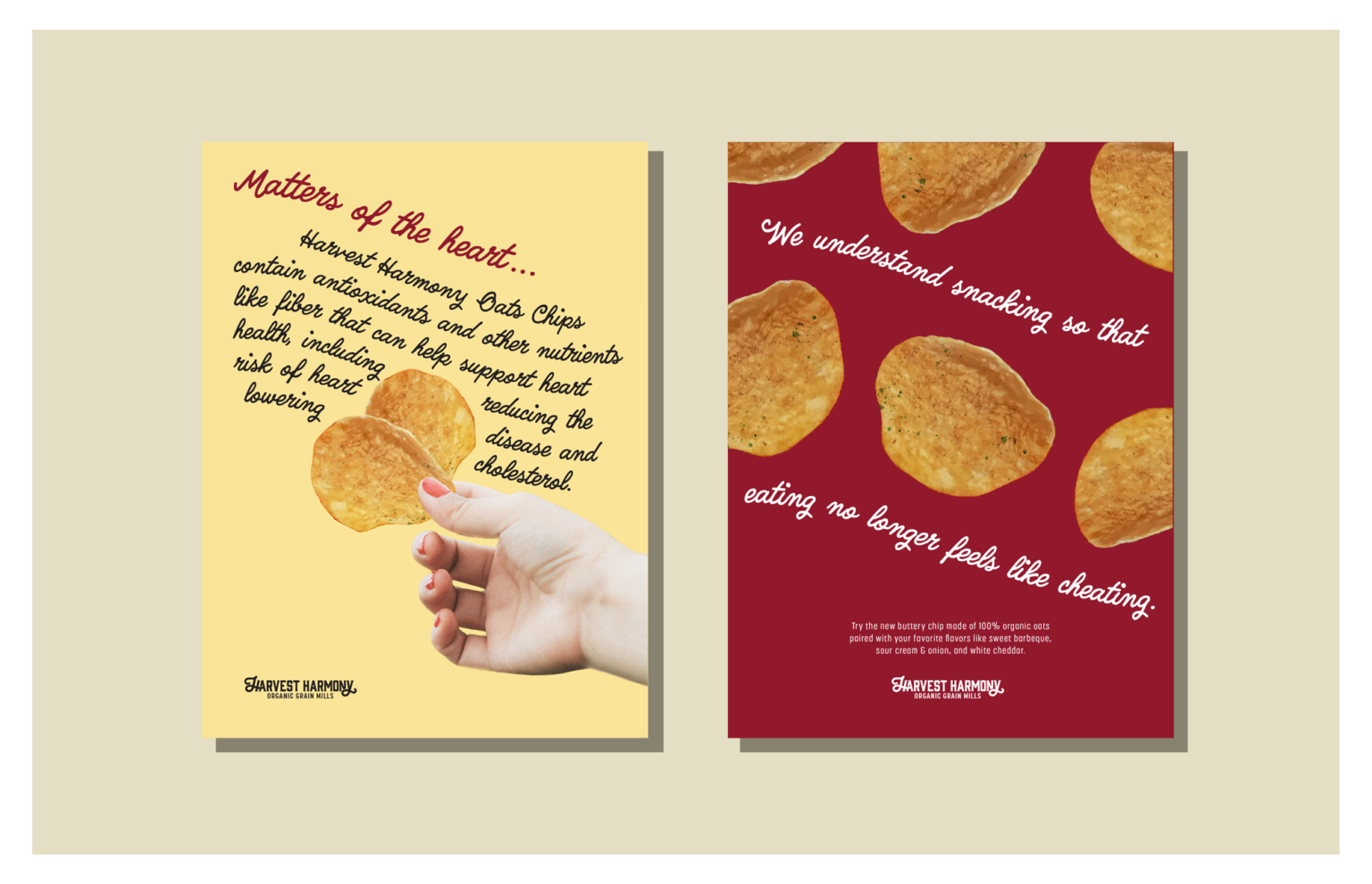
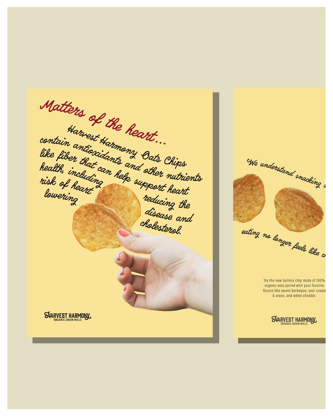
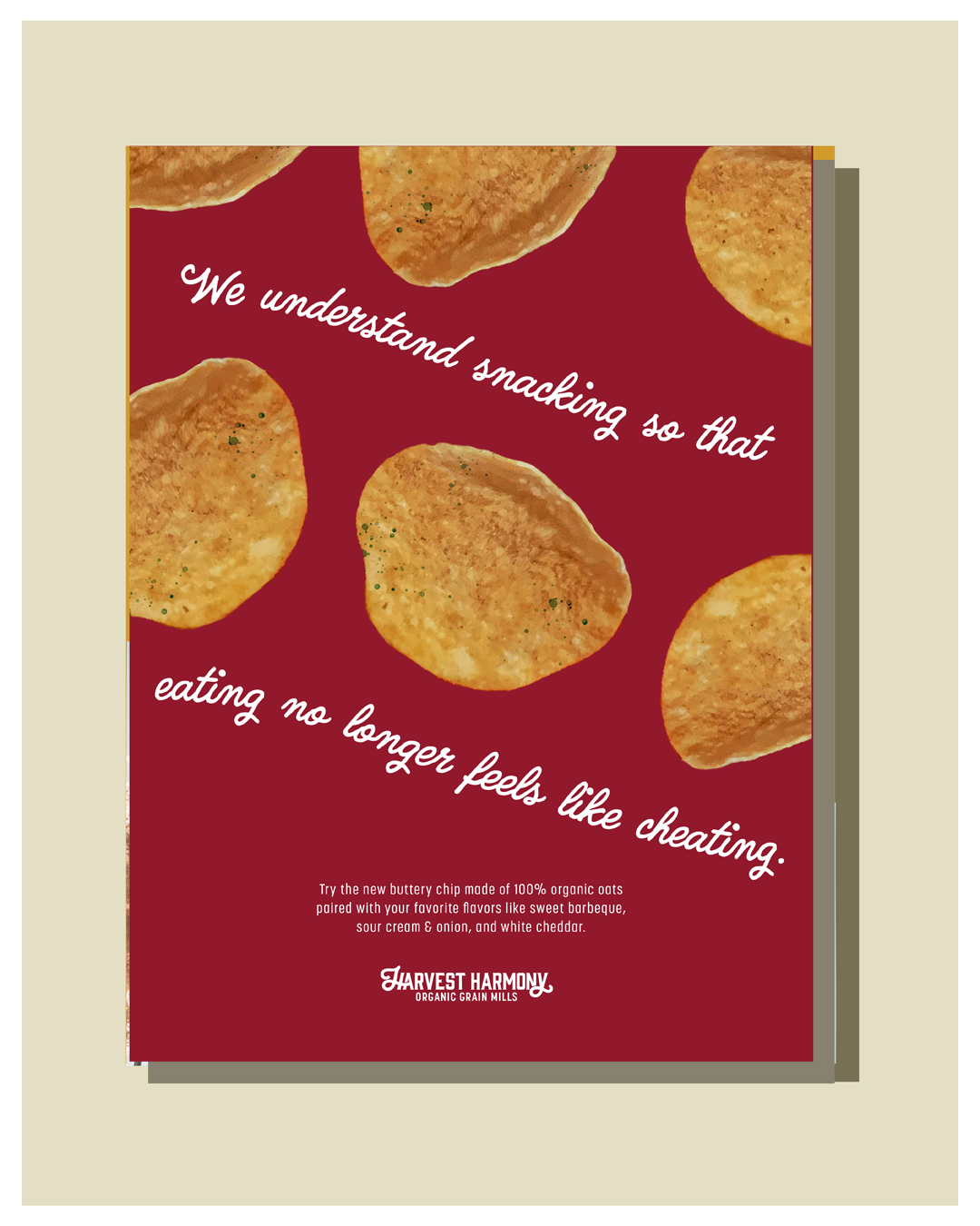
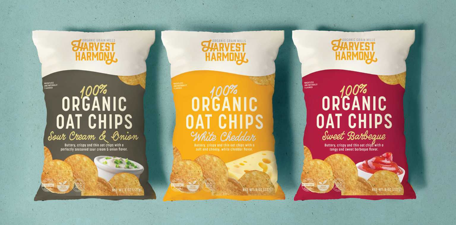
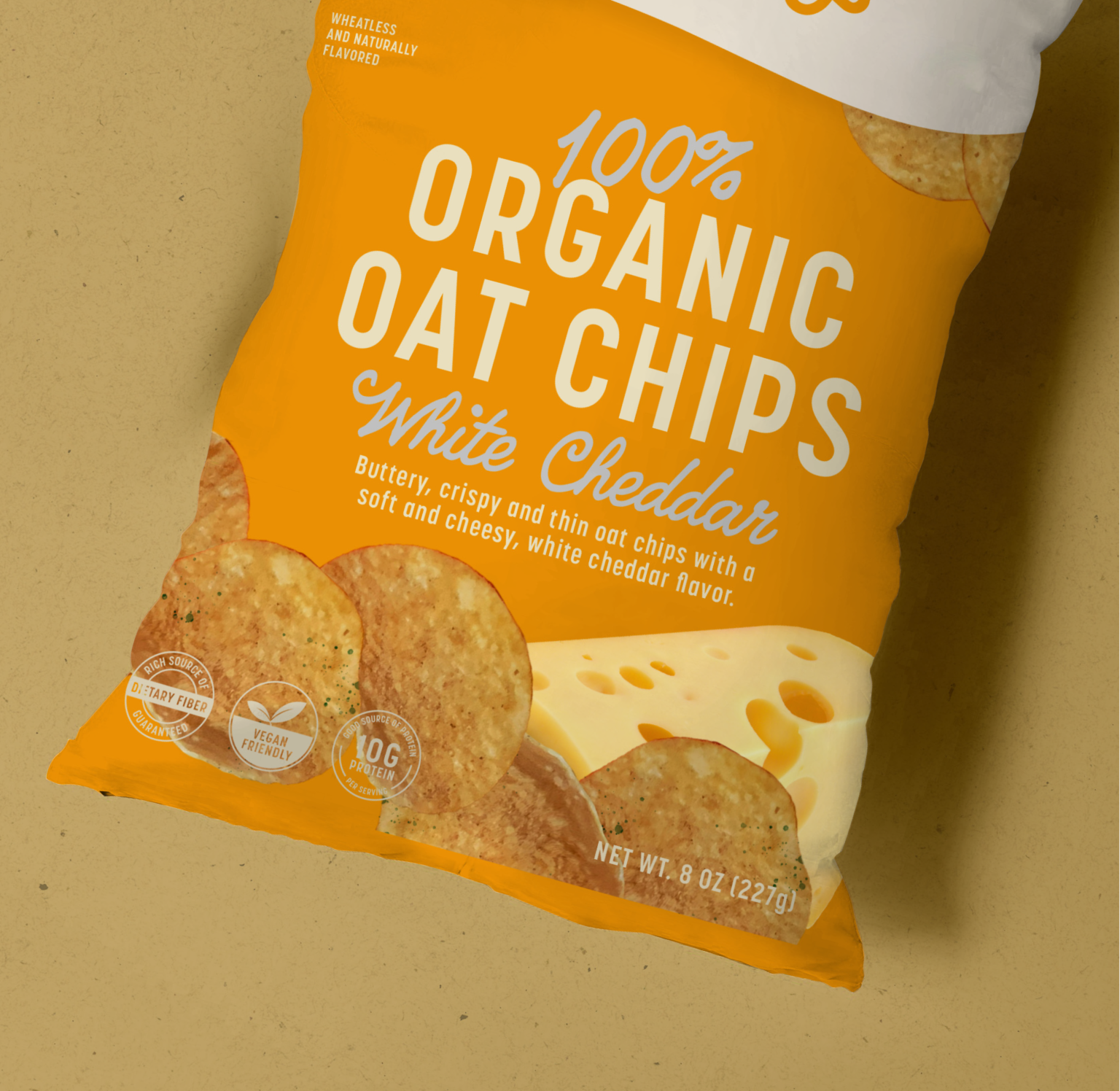
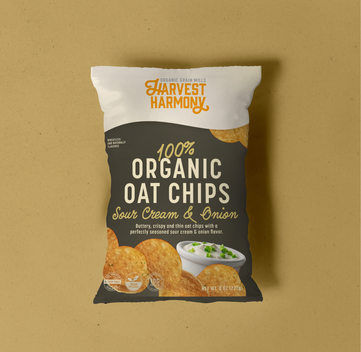
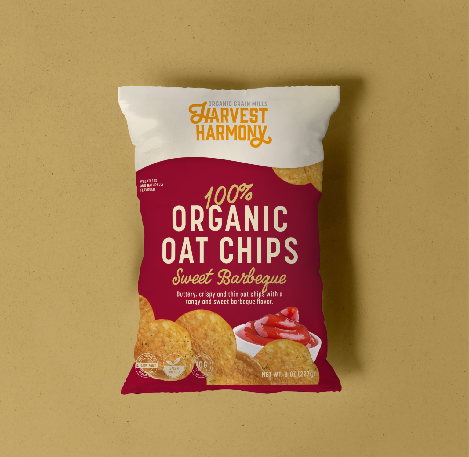
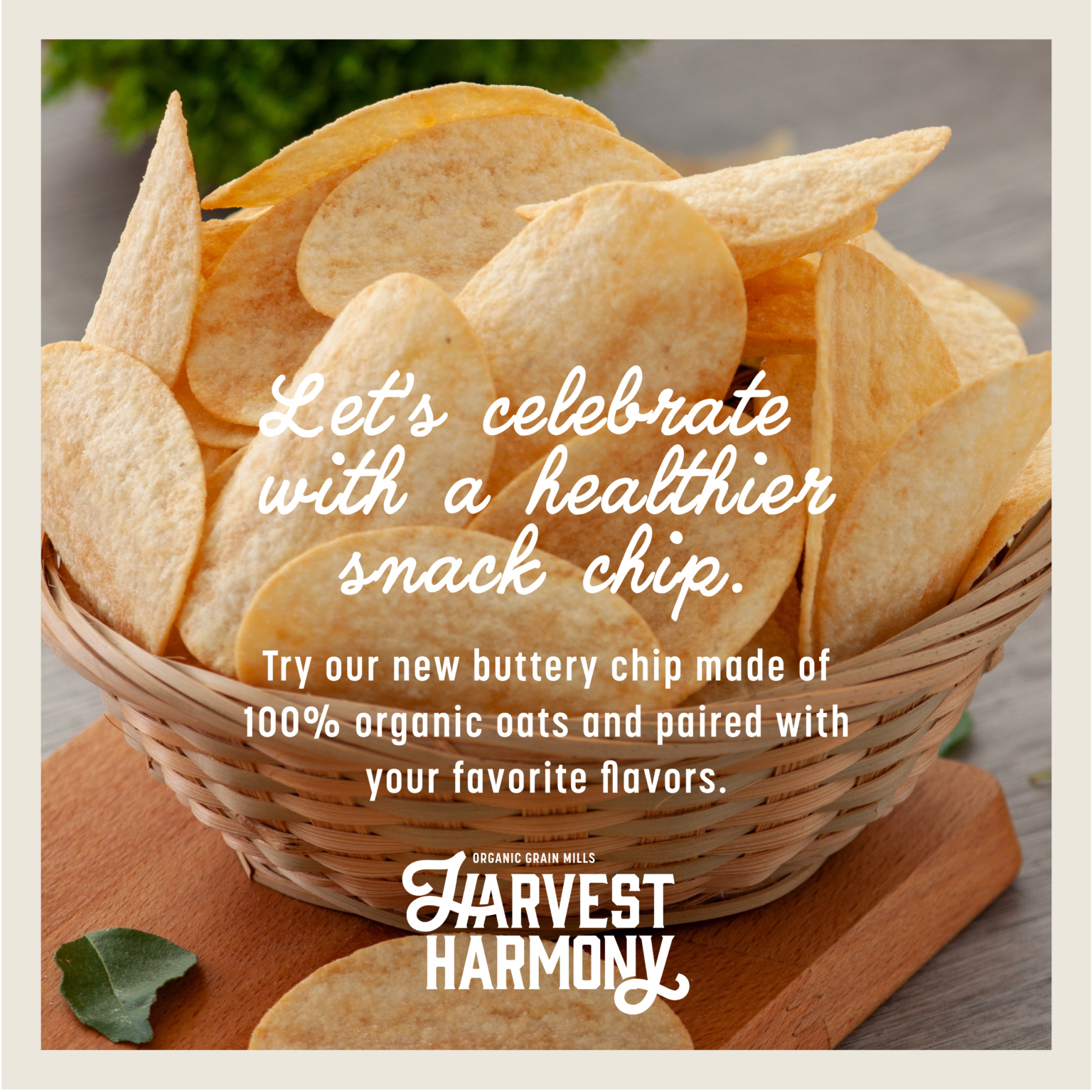
Harvest Harmony is an organic grain farm giving snackers healthier options with flavorful oat chips.
For the visual identity, we wanted to focus on the versatility of the oat chips and their flavors, but to also tie in the concept of vitality and nutrition. To create the brand's atmosphere, the design utilizes bright and warm colors, which causes things to feel upbeat and dynamic and at the same time, enthusiastic. The brand voicing follows through by speaking in a tone that both supports and informs the core audience on products benefits.
Project Scope
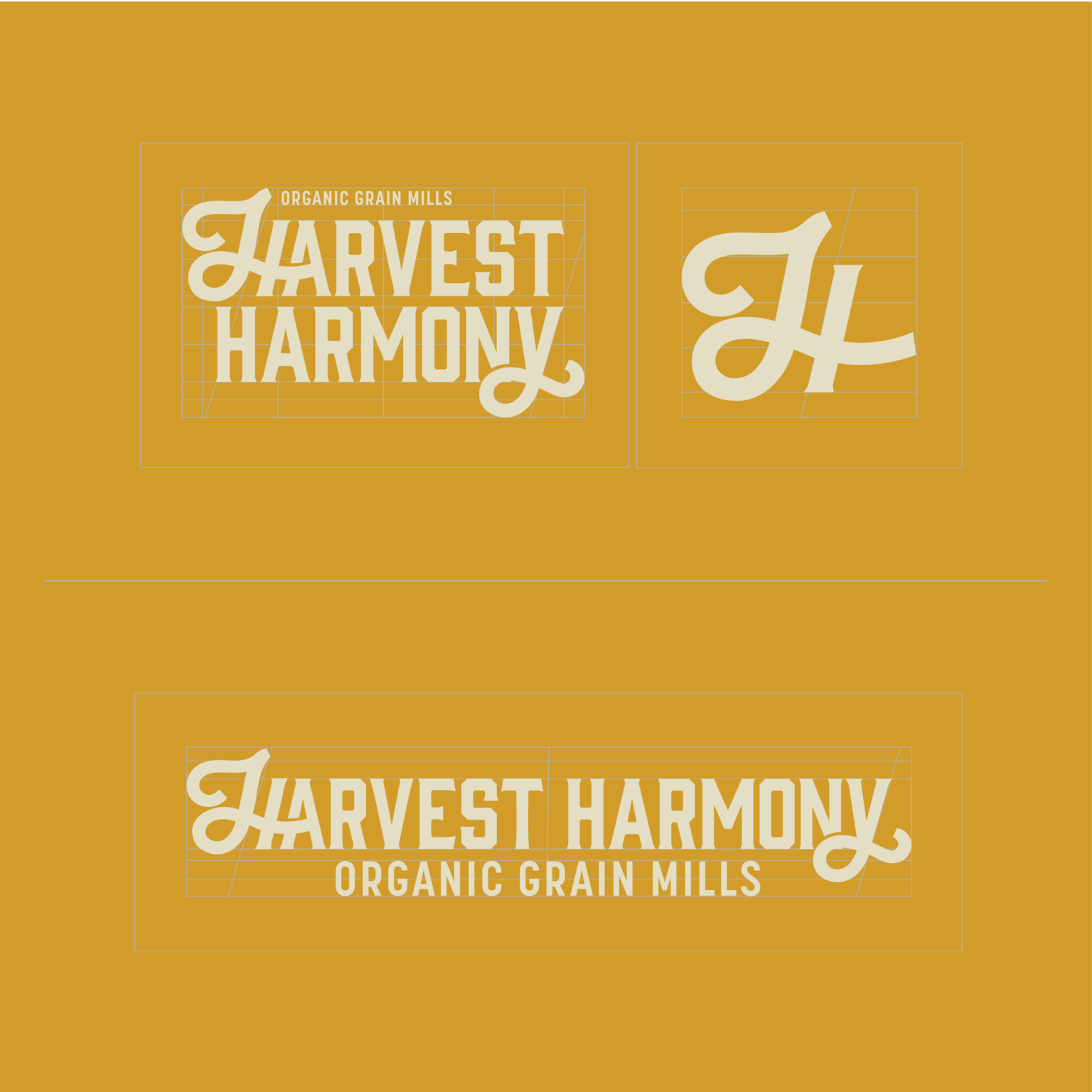
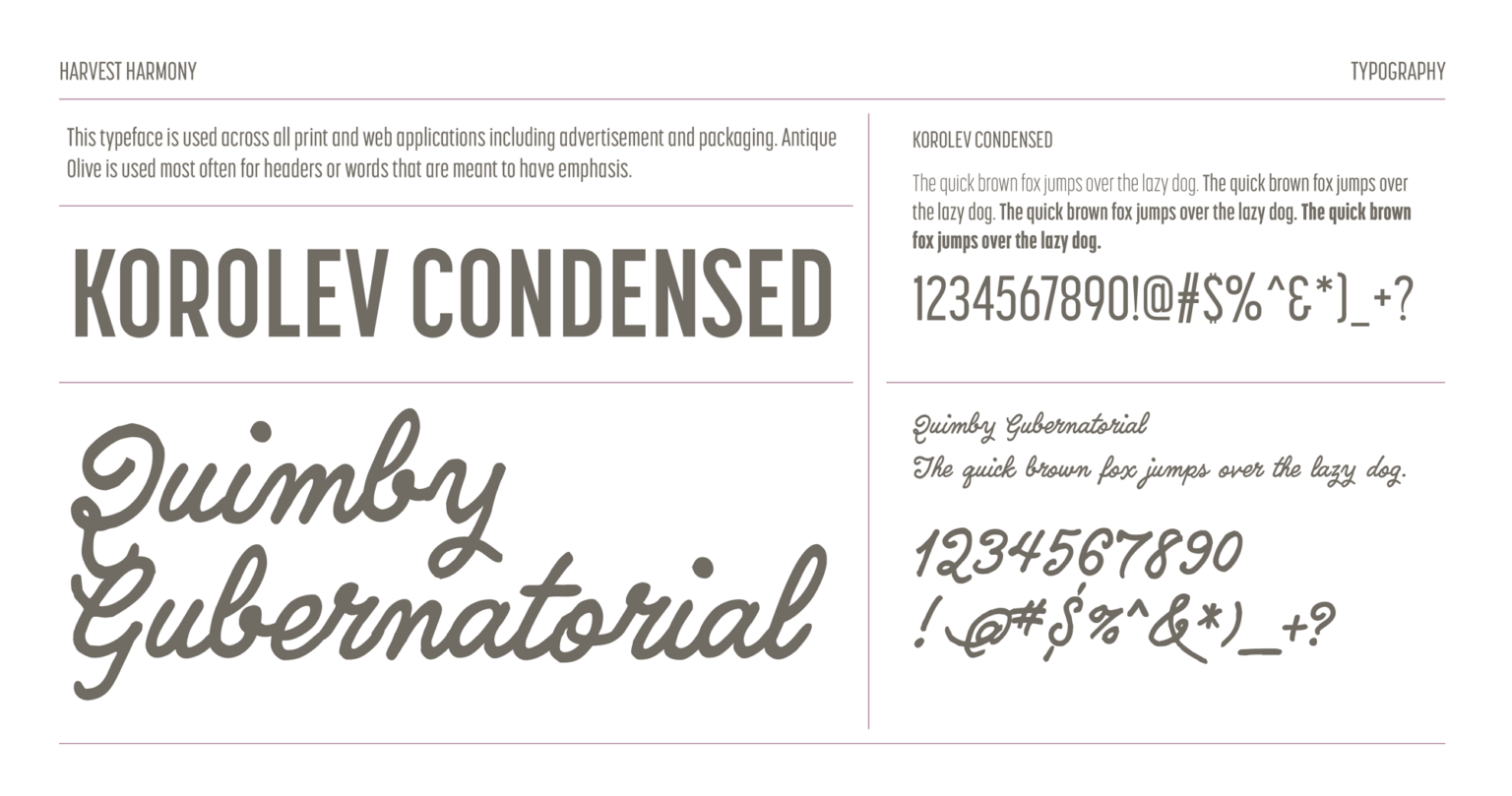
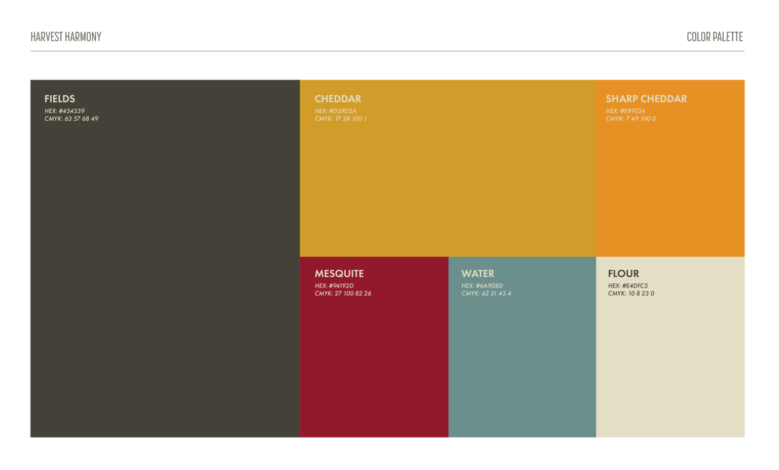
Logo & Color Palette
Brand Messaging
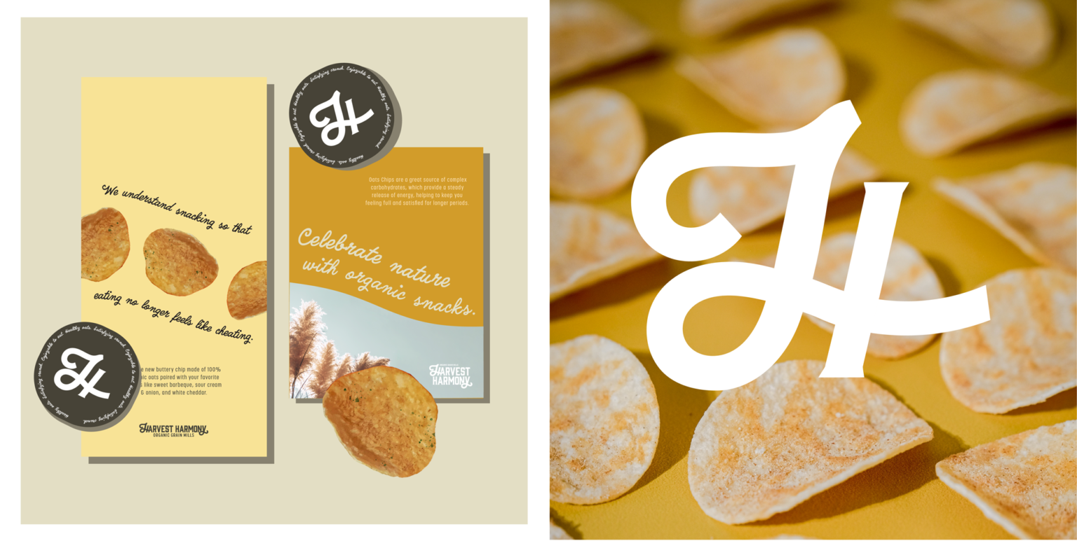
Product Packaging
Print Ads
GOT QUESTIONS OR WANNA LEARN MORE?
We’d love to hear about your business and any upcoming design projects. Let’s talk for a few moments. And possibly create something together.